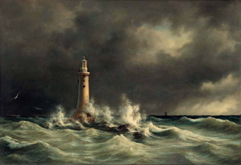
“In literature, the tone of a literary work expresses the writer’s attitude toward or feelings about the subject matter and audience. Depending upon the personality of the writer and the effect the writer wants to create, the work can be formal or informal, sober or whimsical, assertive or pleading, straightforward or sly.”— https://en.wikipedia.org/wiki/Tone_(literature)
Establishing tone with words is something we writers are typically good at: the aesthetic and thematic concerns that drive our work are reflected in the types of stories we tell and how we tell them. But establishing tone through imagery and design for your web site and social media presence can be a challenge if you’re not a designer.
Happily, if you’ve already done your author profile questionnaire: https://www.tanyakwhiton.com/author-profile-questionnaire/
And begun putting together a content bank: https://www.tanyakwhiton.com/start-a-content-bank/
You’ve got some useful information and images re: HOW you want to represent yourself online.
To use myself as an example:
I’m a fiction writer and editor. I love noir film, Victorian novels, and my background as a military brat is a recurring theme in my writing. Each of these interests connects to some specific visual elements that differentiate me from other fiction writers and editors. Click through my web site—https://www.tanyakwhiton.com/ —and you’ll see how those interests are reflected in the overall design.
So the first BIG question we set out to answer in the author profile questionnaire—WHO YOU ARE—is now something you’re considering from a visual standpoint.
To use another example:
Let’s say you’re a poet who writes about the natural world in Maine. You have an interest in wooden sailboats and pollinator gardening, and you’re a passionate steward of the environment. The way you describe YOURSELF and your interests will, ideally, reflect a specific TONE.
So imagine, for a moment, that our hypothetical poet has chosen a web site template with a red, black, and white color scheme, big blocky text, and vague, black and white images that hint at…what is this? Is our poet actually writing thrillers on the sly?
It is also possible to be a little too “on the nose” tone-wise—or, to use a word that makes writers flinch, clichéd. The visual cliché functions the same way a verbal one does. It is lazy shorthand that points at an idea without articulating anything fresh.
So let’s say our poet has created a site with delicate italic lettering and pastoral images of gardens and sailboats bobbing on calm coastal waters, all rendered in pastels.
What’s missing?
That passionate stewardship of the environment, the edge that suggests our poet loves the beauty of the natural world and is willing to go to bat to protect it. That edge suggests a different set of images, a different font, and a different color palette.
What we’re after is what differentiates you from other writers with similar subject matter—a fresh articulation that will let us in, just a little bit, to who you are as an individual.
And that, friends, is what will help you to connect with readers.
Here’s a handy summary of the elements of visual tone: https://www.presentation-guru.com/what-is-visual-tone-in-your-presentation/
NEXT UP: AUDIENCE DEVELOPMENT
